The Post-Purchase Goldmine: Boosting Second-Order Rates on the Thank You Page
Your customers just made their first purchase. They're happy. They trust you. And in this exact moment, most Shopify merchants are doing something shocking: nothing.
The thank you page sits there like a forgotten checkout station—a place customers land for two seconds before closing the tab. But here's what most store owners don't realize: that page has a 100% view rate. Every single person who buys sees it. Compare that to email open rates hovering around 20-30%, and you're looking at the most valuable real estate in your entire customer journey.
The thank you page isn't just a confirmation slip. It's a goldmine. And the businesses nailing their second-order rates understand this better than anyone.
Your second-order rate—the percentage of first-time buyers who purchase again within a defined period—is one of the most overlooked metrics in ecommerce. Yet it directly determines customer lifetime value, reduces your reliance on expensive paid acquisition, and signals whether your product-market fit is genuine or just a lucky first sale. A 20% second-order rate feels respectable. A 40% rate? That's the difference between scaling sustainably and constantly chasing new customers at a 5:1 acquisition-to-retention cost ratio.
This guide walks you through exactly how to transform that overlooked thank you page into a repeat-purchase engine. You'll get specific strategies, implementation steps, and frameworks you can deploy today. By the end, you'll understand why the thank you page might be the single highest-ROI optimization in your store.
Why Your Thank You Page Is Your Most Underestimated Retention Tool
Here's the psychological reality most retailers miss: your customer is in a uniquely vulnerable state right after checkout. They've committed money. They've made a decision. And in that moment, their trust in you is at its peak.
Marketers call this the "halo effect" of purchase. The customer isn't skeptical. They're not comparing alternatives. They've already decided to trust you, and that trust radiates outward. This is why the thank you page converts so dramatically when optimized—and why it's criminal to leave it blank.
Consider the math. If 10,000 customers land on your thank you page each month and 5% of them click on a second-purchase offer, that's 500 additional transactions. At a $75 average order value, you're looking at $37,500 in incremental revenue. Most store owners would spend $5,000 on advertising to capture that same segment with lower conversion rates. Yet the thank you page sits there, unoptimized.
Email is important. But it's also a channel where customers have learned to tune you out. They've unsubscribed before. They've marked promotions as spam. The thank you page has no such baggage. It's a moment of genuine, high-intent engagement.
The other advantage? Immediacy. A customer on your thank you page is in a buying mindset right now. An email sits in their inbox for 48 hours, competing with 100 other messages. By then, the post-purchase glow has faded. Friction has entered their mind. The thank you page captures people when resistance is lowest.
The Foundation: Crafting an Impeccable Confirmation Experience
Before you layer on the second-purchase strategy, get the basics right. A broken foundation destroys everything you build on top of it.
Your thank you page must accomplish three things simultaneously: confirm the purchase, build trust, and prepare the customer for what's next.
The Confirmation Elements That Matter:
Display the order number prominently—but don't just drop a string of digits. Frame it contextually: "Your Order #47291 is confirmed." Include the exact items purchased (ideally with small thumbnails), the total amount charged, and the estimated delivery date. Customers need certainty. Specificity creates it.
Then thank them—genuinely. Not "Thanks for your purchase" in corporate-speak. Something that feels human: "Thank you for joining our community. We're thrilled you chose us." Add their first name. "Hi Sarah, thank you..." converts better than generic copy because it signals a real person on the other end.
Spell out what happens next. "You'll receive a shipping confirmation within 2 hours" is worth more than gold because it eliminates anxiety. Include a direct support email or phone number. Make the customer feel like they're not trapped in a system—they're in a relationship.
This foundation is where most stores stop. Smart stores use it as a launchpad.
Step-by-Step Strategies to Drive Repeat Purchases
Phase 1: Cultivating Community and Loyalty from the Start
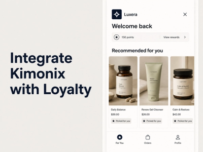
The moment someone lands on your thank you page is your first real opportunity to convert them from a buyer into a member of something larger. And that something is your loyalty program.
Invite Customers Into Your Loyalty Program
Most loyalty program invitations are buried in footer links or tacked onto shipping emails. By then, the customer has moved on. On the thank you page, they're captive and curious.
Present your loyalty program with clarity. Not "Join our rewards program," but "Earn points on every purchase—and get exclusive perks as you go." Show them the specific benefits: "Members earn 1 point per $1 spent. 100 points = $10 off. Plus, birthday bonuses and early access to new launches."
Make joining frictionless. A single-click signup using their purchase data is infinitely better than a form asking for information you already have. Then sweeten it: offer 25-50 bonus points just for joining. This isn't bribery. It's acknowledging that loyalty goes both directions.
The psychology here matters. First-time buyers are in a "proving" mindset. They want to see if you're worth their loyalty. Create a loyalty program that immediately shows value—not in promises, but in points already earned from their first purchase. Let them see the meter moving toward a reward.
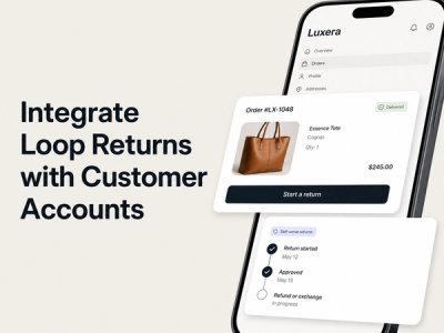
Encourage Account Creation for Future Convenience
This seems basic, but most stores bury it or skip it entirely on the thank you page.
Frame account creation around the customer's benefit, not yours: "Create an account to track your order in real time, save your favorite items, and skip the checkout line next time." Humans respond to convenience and personalization far more than to backend logistics.
Offer a direct path to account creation right there. "Create Account" button, not "Register" (which sounds formal and friction-inducing). Let them use the email they just provided to set a password in one step. Remove barriers.
Here's the insider move: mention that seamless customer accounts let you send them personalized recommendations next time they visit. Customers like personalization when they understand the value exchange. You're not being creepy—you're saving them time.
Leverage the Power of Social Proof
Drop a testimonial or review quote directly on the thank you page. Not just any quote—one from a customer who purchased the exact product they just bought.
Research shows testimonials increase conversions by up to 30%. But timing matters. On the thank you page, social proof does something different than it does on a product page. It doesn't convince them to buy. It validates that they made the right choice. It turns FOMO into confidence.
Display a "Popular with Buyers" badge if your product has strong sales velocity. Show a recent customer review with a real photo. "Loved this! Wear it constantly" with a photo of the product in use hits differently than star ratings alone.
Amplify Your Brand Through Social Sharing
Give customers a dead-simple way to share their purchase on social media. Not because you want free advertising (though that's nice). But because sharing creates commitment. Psychological research shows that people who publicly declare a choice become more invested in it.
Add social media buttons—Instagram, TikTok, Facebook. Suggested text: "Just got this [product name] from [Brand]! 🎉" Pre-populate it to reduce friction.
Then offer a small incentive: "Share on Instagram and get a $5 reward" (or whatever currency your loyalty program uses). This isn't expensive. It's incredibly cheap acquisition compared to paid ads. And the customer is sharing to their audience, not your audience—which means the social proof carries weight their friends will respect.
Ready to increase customer lifetime value?
Join 100+ Shopify stores using Mage to turn one-time buyers into loyal repeat customers.
Phase 2: Strategic Upselling and Cross-Selling That Converts
This is where second-order rate strategy meets immediate revenue. The key is making offers that feel helpful, not pushy.
Personalized Product Recommendations
Generic "customers also bought" recommendations waste the thank you page's prime real estate. Instead, use the product they just purchased as a signal for what comes next.
If someone bought a winter jacket, recommend base layers or gloves. If they bought a skincare serum, suggest the moisturizer that complements it. The recommendation should feel inevitable—like you're extending the value of their original purchase, not just upselling.
Advanced implementations use purchase history, browsing data, or behavioral signals. But even basic logic-based rules work: bundle complementary SKUs, suggest the next size up, or recommend the bestseller in the adjacent category.
The statistic is well-known but worth reinforcing: 80% of shoppers respond favorably to personalized experiences, and personalized CTAs convert 42% more leads. On the thank you page, this isn't theoretical. It's a customer literally looking at the product they just bought. Show them what logically comes next.
Exclusive Discounts and Time-Sensitive Offers
A discount code specifically for their next purchase works. But framing matters enormously.
Instead of "Get 15% off your next order," try "You've unlocked 15% off anything for your next 7 days—use code WELCOME15." The difference? The first is a generic promotion. The second feels like a personal reward.
Time sensitivity is critical. Without a deadline, the discount gets lost in their mental queue. With an expiration date ("Valid for 7 days"), you create urgency without being aggressive. Seven days is long enough to be fair but short enough to motivate.
Walmart reportedly runs $10-off or 10% off offers on their thank you pages. Why? Because in that moment, the customer is already in a spending mindset. The psychological barrier to a second purchase is lower than it will be in a week. Capture that momentum.
Research cited by RetailMeNot found that 93% of consumers likely make repeat purchases from retailers offering good discounts. But here's the part most retailers miss: the discount itself isn't the primary driver. The signal that you value their repeat business is. A modest discount that says "we want you back" often outperforms a massive markdown because the customer reads the subtext: you care about retention, not just extraction.
Bundle Offers and Subscription Opportunities
Bundles work because they simplify decision-making. Instead of "browse and decide," you're saying "here's a curated set that solves your full problem, and it costs less than buying separately."
On the thank you page, bundle the complementary items to their recent purchase. Sold a coffee maker? Bundle it with beans and a grinder. Show the savings: "Save $12 with this bundle" or "Complete your set."
Subscription options deserve their own mention because the math is different. A subscription isn't just a second order—it's recurring revenue. Offer it as "same great product, delivered every month and save 15%." For consumables (skincare, supplements, coffee), subscriptions dramatically increase lifetime value.
The hesitation most customers have with subscriptions is commitment anxiety. Address it directly: "Cancel anytime. No penalties." This actually increases conversions because it removes the friction from the decision.
Phase 3: Fostering Engagement Beyond the Next Sale
Not every thank you page offer is about immediate revenue. Some of the highest-ROI moves plant seeds for future purchases.
Valuable Content and Resources
The counter-intuitive move: instead of only selling on the thank you page, also help.
Point them to a "getting started" guide. A how-to video on using the product. A blog post on the topic they're interested in. This feels generous because it is. And generosity builds loyalty faster than discounts do.
For higher-consideration purchases or products requiring setup, this is especially powerful. A customer who watches your three-minute installation video is more satisfied with their purchase and more likely to recommend it. They're also more likely to come back because they've extracted more value from what they bought.
Newsletter Sign-Ups With an Incentive
Email list building matters, and the thank you page is one of the highest-converting places to do it.
But don't ask them to subscribe to "our newsletter." That's vague. Instead, be specific: "Subscribe to get 10% off your next order, plus styling tips from our founder each Friday."
An Emarsys study found that 80% of retail professionals identify email as the most effective customer retention tactic. But that's only true if the list is built on genuine interest, not guilt. Give a real reason to subscribe, and you'll build a list that converts.
Gathering Customer Feedback
A short, non-intrusive survey does two things: it shows you care about their opinion (which feels good), and it gives you data to improve.
Keep it to 2-3 questions: "On a scale of 1-10, how happy are you with your purchase?" and "What could we have done better?" Don't ask for their life story. Just signal that you're listening.
This feedback loop is where most retailers miss gold. Customers who provide feedback feel heard, even if nothing changes. And the data you collect becomes invaluable for converting first-time buyers into repeat customers because you now know what worked and what didn't.
Measuring Your Post-Purchase Goldmine: Tracking Success
You can't optimize what you don't measure.
Defining Second-Order Rate Metrics
Calculate your second-order rate this way: Take the number of customers who made a second purchase within 90 days of their first purchase, divide by the total number of first-time buyers in that period, and multiply by 100. That's your rate as a percentage.
A 20% second-order rate is respectable. 30% is good. 40%+ is exceptional and suggests strong product-market fit.
But context matters. A luxury brand with 12-month purchase cycles might see 5% second-order rates in 90 days. A consumables brand might see 80% in the same window. Your benchmark depends on your category.
Track Customer Lifetime Value (CLV) separately. This shows you how much total revenue each customer cohort generates. Two stores might have the same second-order rate but radically different CLVs if repeat customers spend 2x more on subsequent purchases.
Leveraging Analytics for Insights
Set up conversion tracking on your thank you page using Google Analytics or your ecommerce platform's native dashboard. Track clicks on each CTA—loyalty program signup, discount code, cross-sell recommendations, social sharing buttons.
Create a segment of customers who clicked your "15% off next purchase" offer and compare their repeat purchase rate to customers who didn't. This shows you which offers actually move the needle.
Then segment by customer cohort. Do new customers respond better to loyalty program invites or discounts? Do customers who spent over $100 convert better to premium offers? This data becomes your playbook.
The Power of A/B Testing: Optimize Your Way to Higher Conversions
This is where the magic happens.
Start simple. Test two versions of your thank you page—one is your current control, one has a single change. Maybe Version A emphasizes the loyalty program prominently at the top. Version B buries it and leads with a personalized upsell.
Run the test for two weeks or until you have 500+ conversions per variation (whichever takes longer). Small samples lie. Statistical significance matters.
The variables worth testing:
- CTA positioning: Top of page vs. sidebar vs. bottom
- Offer types: Discount percentage vs. loyalty points vs. free product
- Copy style: Formal vs. casual, scarcity-driven vs. benefit-driven
- Visual hierarchy: Hero image vs. minimal design, video vs. still image
- Timing: Immediate upsell vs. "come back tomorrow for a special offer"
One store increased their thank you page conversion rate from 0% to 3.57% in a month through systematic testing. Another added nearly $53,000 in revenue in 30 days by A/B testing post-purchase offers. These aren't anomalies. They're the result of treating the thank you page like the business-critical asset it is.
Advanced Tactics for Maximizing Second-Order Rates
Hyper-Personalization Through Segmentation
Not all customers are the same. Yet most thank you pages treat them identically.
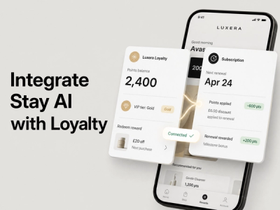
First-time Buyers vs. Repeat Customers
A first-time buyer landing on the thank you page for purchase #1 needs different messaging than a customer on their fifth purchase. The first-timer is in "prove it to me" mode. The repeat customer is in "reward my loyalty" mode.
For first-timers, emphasize the loyalty program heavily. Show them how easy it is to earn and redeem points. Make joining feel like joining a club, not a marketing list. An invitation to the community matters more than a discount at this stage.
For repeat customers, skip the onboarding. They know how your program works. Instead, offer VIP perks—early access to sales, exclusive products, or a surprise bonus in their account. Recognition matters more than explanation.
The platform Mage Loyalty, alongside Rivo and Growave, makes this segmentation straightforward by allowing you to set conditional logic: if customer count > 1, show message X; if count = 1, show message Y.
High-Value vs. Average Customers
A customer who just spent $500 should not see the same offer as someone who spent $50.
For high-value customers, present membership in a VIP tier. Free shipping on all future orders. Early access to limited editions. A personal account manager. These customers expect special treatment, and they'll pay (literally) for it.
For average-spend customers, emphasize value and community. Loyalty points. Bundle discounts. Referral bonuses. These buyers are price-conscious, so show them the financial incentive to return.
Product-Specific Segments
Someone who bought a winter coat needs different follow-up than someone who bought skincare.
A coat buyer might benefit from complementary winter accessories. A skincare buyer needs education—routines, ingredients, application tips. Your upsell for the coat is transactional. Your upsell for skincare is educational, which builds deeper engagement.
This is where converting first-time buyers into repeat customers becomes an art. You're not just pushing the next sale. You're understanding the customer's underlying need and meeting them where they are.
The Counter-Intuitive Strategy: When Less Can Be More
Here's a take that contradicts the conventional wisdom: aggressive upselling on the thank you page doesn't always drive higher second-order rates. Sometimes it kills them.
Consider a luxury brand or a high-consideration purchase. A customer who just spent $800 on a premium item doesn't want to land on a thank you page crammed with "buy more stuff." They want confirmation, reassurance, and maybe an invitation to a community. Bombarding them with offers feels tone-deaf.
The research on customer fatigue is clear: when you ask for too much too soon, people withdraw. They feel manipulated rather than served. For luxury goods, high-end services, or products requiring significant onboarding, a quieter thank you page might outperform an aggressive one.
Here's the framework: if your average order value is above $200 or your product requires customer success (implementation, learning curve, setup), prioritize experience and support over immediate upsells. Let the customer settle into their purchase for 48-72 hours, then send them a follow-up email introducing the next offer.
For consumables, fast-fashion, and low-consideration items under $50? Go aggressive. Test the limits. These customers expect to be marketed to, and they respond well to urgency.
The data supports this. A luxury watchmaker testing a minimal thank you page (just confirmation, plus an invite to a VIP community) saw second-order rates jump 18% compared to a heavily promotional version. A DTC coffee brand testing the same minimal approach saw rates drop 9%. Context, not dogma, drives optimization.
Designing for Conversion: UX and Visual Best Practices
The strategy means nothing if the execution is sloppy.
Clarity and Simplicity
Your thank you page should take less than 10 seconds to fully parse. If a customer has to scroll three times to understand what you're offering, they've already left.
Use a clean, uncluttered layout. One primary CTA (loyalty program signup, discount code, or personalized recommendation) and maybe one secondary CTA (newsletter, social sharing). Anything more is noise.
White space is your friend. Let elements breathe. A page that looks spacious feels premium. A page crammed with text and images feels desperate.
Mobile Responsiveness
Over 60% of ecommerce traffic is mobile. Your thank you page must be flawless on mobile, not just functional.
Test it on your phone. Are buttons clickable without zooming? Does the thank you message render properly? Do images load without crushing load time? A slow, clunky mobile experience will destroy your second-order rate faster than a weak offer.
Visual Appeal and Brand Consistency
Your thank you page is an extension of your brand. It should feel like the same brand that the customer experienced during checkout.
Use your brand colors, fonts, and imagery consistently. If your product pages are vibrant and playful, your thank you page should match. If they're minimal and premium, the thank you page should reflect that.
Consider adding a short, personalized video message from your founder or a team member. A 30-second video saying "thanks for believing in us" humanizes your brand in a way text never can. It's surprisingly effective.
Clear Calls-to-Action
CTA buttons should be visually prominent. Use contrasting colors. Make text action-oriented: "Join & Earn 25 Points" instead of "Sign Up." "Get 15% Off Next Purchase" instead of "Continue Shopping."
Ensure buttons are large enough to click easily (at least 44x44 pixels on mobile). Test that they work across devices and browsers.
Shopify Merchants: Customizing Your Thank You Page
Shopify's default thank you page is barebones. It confirms the order and... that's it. If you're still using it as-is, you're leaving money on the table.
Beyond the Default: Apps and Extensibility
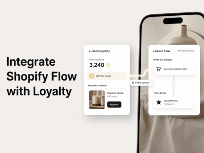
Shopify apps like Aftersell, MomentPerks, and similar platforms allow you to add upsells, cross-sells, loyalty program invitations, and personalized offers to your thank you page without touching code.
These apps work by inserting content into a specific section of your thank you page. You design the offer in the app's interface, set conditions (like customer segment or AOV), and publish. No developer needed.
For Shopify Plus merchants, Shopify's Checkout Extensibility feature (which replaces the older checkout.liquid customization) allows even deeper integration. You can create custom post-purchase experiences that feel native to your brand and flow seamlessly from checkout.
The advantage of using apps or Checkout Extensibility over custom code is maintainability. When Shopify updates the theme or checkout system, your customizations keep working. Custom code can break.
Implementation Priority
Start with one app that solves your primary goal. If you want to boost loyalty program signup, choose an app built for that. If you want post-purchase upsells, pick a different one. Master one before layering on complexity.
Most of these apps integrate with your loyalty platform (whether that's a standalone tool or a sustainable customer retention strategy built into your existing stack), allowing you to give points automatically when customers complete actions on the thank you page.
Designing Your A/B Testing Roadmap
You now understand the strategies. Here's how to test them systematically.
Month 1: Baseline and Loyalty Focus
Launch your thank you page with a strong loyalty program invitation as the primary CTA. Measure baseline second-order rate (use a 60-day window). Track signup rate on the loyalty CTA.
Month 2: Discount vs. Points
Run version B with a percentage discount instead of a loyalty invite. Compare signup/redemption rates between the two. Don't just look at clicks—look at actual redemptions and second purchases.
Month 3: Personalization
Segment your audience and test different messages for first-timers vs. repeat customers. Does the repeat customer version convert higher?
Month 4: Visual and Copy Tests
Once you've nailed the offer, test variations in presentation. Video vs. static image. Urgent copy vs. benefit-driven copy. Top placement vs. middle placement.
Keep detailed records. Create a spreadsheet of each test, the hypothesis, the winner, and the revenue impact. This becomes your internal playbook.
Conclusion: Your Thank You Page – A Continuous Journey of Optimization
Your thank you page is not a static confirmation screen. It's a dynamic revenue driver that deserves as much attention as your product pages or ad campaigns.
Every percentage point increase in second-order rate compounds over time. A 25% second-order rate is 25% cheaper than a 20% rate, all things being equal, because you're building revenue from existing customers instead of burning money acquiring new ones.
The strategies in this guide work across industries and price points. The execution varies based on your specific business, but the principles remain: confirm purchases with clarity, invite customers into a community, offer helpful products and resources, and test relentlessly.
Your customers are ready to buy again. They're on your thank you page, happy, and receptive. The question isn't whether you can drive second-order rates. It's whether you'll optimize the goldmine in front of you.
Start today. Pick one strategy—loyalty program invitation, personalized upsell, or discount offer. Implement it. Measure results. Iterate. The compounds of compounding repeat purchases will surprise you.
Frequently Asked Questions About Thank You Page Optimization
What is considered a good second-order rate benchmark for ecommerce?
Benchmarks vary significantly by industry. Consumables (food, supplements, skincare) often see 40-60% second-order rates within 90 days because replenishment is built into the category. Fashion and home goods typically see 20-30%. Luxury goods might see 5-15% because purchase cycles are longer. The ecommerce conversion rate benchmarks vary, but a 25% second-order rate across any category is solid. If you're below 15%, focus on product quality and customer experience before optimizing the thank you page.
How soon after a purchase should I offer a discount on the thank you page?
Immediately. The thank you page is shown during the post-purchase moment when customer trust and buying intent are both at peak levels. A discount offered then has higher redemption rates than the same discount offered 48 hours later via email. The psychology works because the customer is already in a spending mindset and the friction to a second purchase is lowest.
Can I effectively use video content on my thank you page, and what are the best practices?
Yes, video works well on thank you pages when it serves a purpose. A 30-second founder message, a product demo, or a "how to get started" guide all perform well. However, auto-play video can slow page load times and feels aggressive. Allow users to click play rather than auto-playing. Keep videos short (under 60 seconds), ensure they're mobile-optimized, and include captions for accessibility. Test video-based thank you pages against static image versions to measure impact on conversion rates.
Is it advisable to immediately request a product review or feedback on the thank you page?
Timing matters here. Asking for a review immediately feels premature—the customer hasn't used the product yet. Instead, invite them to review after they've had time to unbox and experience the item. Use the thank you page to direct them to a feedback form or review link they can access later. A better approach: offer loyalty points for leaving a review, then send them a follow-up email 5-7 days later with the direct link. This drives higher-quality reviews because customers have actually experienced the product. Platforms like Mage Loyalty, Rivo, and Growave support this by automating the review request workflow based on time delays and customer segments.
What is the key difference between a thank you page and an order confirmation email, and why do both matter?
A thank you page is synchronous—it appears immediately when the customer completes checkout. An order confirmation email is asynchronous—it arrives in their inbox later, often competing with other messages. The thank you page has a 100% view rate and a captive audience. The confirmation email has a 20-30% open rate but reaches people when they're less sales-ready. Use the thank you page for immediate engagement (loyalty signup, personalized upsell) and the confirmation email for logistics (shipping updates, order details) and follow-up nurturing. Both are essential because they serve different psychological states and purposes in the customer journey.