A shopper lands on a product page, checks the price, adds an item to cart, then completes checkout without seeing what they could earn or how to join. That same shopper receives an order confirmation, opens a promotional email next week, and still has no route back to their rewards. Loyalty program on site placements fix that discovery path by putting the program in front of customers while they are shopping, buying, and returning.
Short answer: A low-enrollment program can have a perfectly reasonable offer and still go unnoticed. Build a visible route through the product page, cart, checkout, order confirmation, account area, email footer, and package. Then measure whether eligible customers saw the placement, clicked it, enrolled, redeemed, and returned.
Start with a loyalty program on site placements audit
| Customer state | Placement | Primary job | Recommended CTA | Core metric |
|---|---|---|---|---|
| Anonymous shopper | Product page | Explain immediate earning value | Join and earn | Eligible views to signups |
| Active buyer | Cart or checkout | Connect rewards to current order | Sign in or view rewards | Clicks to checkout engagement |
| Existing member | Account area | Make balance and rewards usable | View rewards | Reward views and redemptions |
| Post-purchase buyer | Confirmation or insert | Give a reason to return | Activate rewards | Visits to loyalty destination |
Why enrollment is usually a visibility problem
Start by checking whether customers can actually find your program. An attractive reward does little if it lives only on a loyalty landing page that shoppers never visit.
The 2024 EY Loyalty Market Study found that 63% of respondents most recently enrolled in a loyalty program through a brand’s mobile app or website. Your storefront needs clear entry points, especially on mobile.
Map placements to customer intent
Anonymous shoppers need a reason to join. Buyers need reassurance that earning and redemption work. Existing members need their balance, tier progress, and available rewards within reach.
Research from BCG and Shopify found that stores with AOV below $200 could see a 4% to 6% lower-funnel conversion lift from loyalty customization. Treat that as context for testing, not a promised outcome.
Separate enrollment, redemption, and re-engagement
A product-page message can drive enrollment. A checkout block can prompt redemption. An account placement can bring a member back to see what they have earned.
If your program is already live but participation is weak, use this guide to relaunch a loyalty program nobody uses before increasing points costs or adding a larger signup reward.
Build the foundation: navigation, header, and your dedicated loyalty page
Placement 1: make loyalty part of primary navigation
Put Rewards, Loyalty, or Earn rewards in the header or account menu. Do not bury it in a footer or expect a temporary homepage banner to do the job.
The label should tell customers what they will find. “Rewards” works better than vague account language because it describes the benefit before the click. For a seasonal brand, a fashion loyalty program might also use navigation to point customers toward VIP early access around a drop.
Placement 2: create a dedicated loyalty page
Your loyalty page is the destination for navigation links, email footers, QR codes, post-purchase calls to action, and customer-service replies. It should answer five questions quickly:
- What customers earn
- Which actions earn rewards
- What rewards are available
- When rewards become usable
- How a customer joins or signs in
A Shopify loyalty program should have this permanent home even when the rest of the experience appears in widgets, checkout, or customer accounts.
Use one clear call to action everywhere
Choose one primary action for guests, such as “Join rewards” or “Start earning.” Give members a different route, such as “View rewards” or “See your balance.”
Mage supports a dedicated loyalty page, and its Account Sidebar can send customers either into the sidebar rewards experience or to an external loyalty landing page. Keep the destination consistent across your site.
Put the offer where shoppers decide: product pages and collection browsing

Placement 3: show the earning opportunity near the product CTA
The product page is where a shopper weighs price, value, shipping, and fit. Show what the current item earns near the price or Add to Cart button, not in a separate loyalty tab far below the fold.
Use language that ties the value to the item: “Earn 200 points with this purchase” or “Earn $10 in store credit after this order.” Only show store credit language if that is your actual loyalty currency, and explain any approval delay if credit is issued after a returns period.
Also state the eligibility rule. Does the customer need to join? Sign in? Make a qualifying purchase? A compact line of copy can answer that without turning the product page into a program manual.
Mage’s product points calculator shows customers how many points a specific product earns.
Placement 4: repeat the message on collection tiles or high-intent browsing surfaces
Collection pages suit a lighter version of the same message. A small badge or line below a price can reinforce that shopping produces value, particularly on repeatable products or products with a clear price range.
Do not force a large loyalty panel into every collection tile. Use the message on priority collections, campaign landing pages, or quick views where the shopper already has purchase intent.
Make the reward concrete, not abstract
“Join our rewards program” asks customers to do extra work without explaining the payoff. “Earn points on this order” connects the program to an action already under consideration.
VIP multipliers and bonus point campaigns can add urgency, but they belong beneath the core earn message.
“Cannot say enough good things about the team at Mage Loyalty, one of the absolute best organizations we have ever worked with, full stop! So glad we connected with them, completely redid our loyalty program, new concepts, use of loyalty, increasing user engagement, showing us where we were not valuing our best customers, just WOW, amazing team!”


Read the West Coast Goalkeeping case study →
Catch high-intent shoppers in the cart and checkout
Placement 5: add a cart or cart-drawer reminder
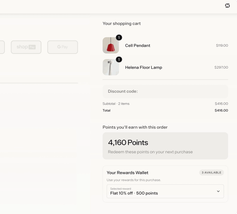
The cart is the right place to show what the current basket earns. Use a short reminder beside the subtotal or beneath the cart items, then link to join, sign in, or view rewards.
Do not require account creation before checkout. Let first-time buyers complete the order, then give them a clear path to activate their rewards afterward.
A cart message can also help members who are not signed in. “Sign in to view and use your rewards” explains the next action.
Placement 6: show earning and redemption at checkout
Checkout is where loyalty becomes credible. Customers can see what they will earn from the order and, when eligible, use rewards against the purchase.
Shopify supports app blocks on checkout, thank you, order status, and customer account pages through its checkout and accounts editor. Availability differs by page, so test the exact configuration available to your store.
Mage Checkout Extensions can show loyalty value at checkout. Its Flexible Redemption block lets logged-in customers redeem points within a configured range, but it requires an active flexible amount reward before it appears. See the Flexible Redemption block setup for configuration detail.
Do not let accelerated checkout hide the program
Keep the placement compact. BCG and Shopify reported that lower-funnel conversion may decrease by around 47% on average when checkout takes longer than 90 seconds. Keep loyalty content useful and non-blocking.
Test checkout on a phone and test Shop Pay separately, because accelerated checkout can bypass the experience configured for standard checkout.
Use the purchase moment twice: order confirmation and packing inserts
Placement 7: turn the thank you or order status page into the next loyalty touchpoint
The order confirmation page should first confirm the order. Place loyalty below the delivery, payment, and order details so the page does not feel like a second checkout.
Tell customers what they earned, where to find it, and what action they can take next. “Activate your rewards,” “View your balance,” and “See ways to earn” all work when they lead to a useful destination.
Shopify supports app blocks on thank you and order status pages, though the installed app and page configuration determine exact placement.
Placement 8: put a QR code or short URL in the package
A packing insert reaches customers after purchase and can connect the physical package to the loyalty page. Use one QR code that opens the loyalty page or account experience, plus a short benefit-led line.
For a replenishment product, focus on earning toward the next order. For a high-AOV purchase, lead with VIP benefits, anniversary rewards, or early access where those perks exist.
Test the QR code from a phone in an incognito browser and from a logged-in customer account. Those are two different experiences.
Ask for enrollment after value has been delivered
Use the confirmation page and insert to support repeat visits, not to overload a buyer with another promotion.
For a wider post-purchase plan, see how to increase repeat revenue after the first purchase.
Make email and customer accounts persistent discovery channels
Placement 9: add loyalty to every relevant email footer
One launch email is not enough. Add a Rewards or Loyalty link to relevant promotional, transactional, post-purchase, and replenishment emails so customers repeatedly encounter the program while they already recognize your brand.
Use different destinations based on customer state. Guests can receive “Join rewards.” Existing members can receive “View your rewards.” VIP customers can receive “Check your tier.” Tagged links help distinguish footer traffic from a campaign-specific call to action.
The footer needs a clear label and a direct route to the loyalty page or account experience.
Placement 10: make the account area a loyalty hub
Logged-in customers should not need to hunt through separate pages for their balance, rewards, tier status, referral code, and saved products. The account area is where repeat shoppers return to check orders, addresses, and account details. Loyalty belongs there too.
Mage’s Account Sidebar can show points balance, rewards, VIP tier progress, referral access, wishlist content, recently viewed products, and other configurable blocks. Customers can open it through the Rewards Widget or the account experience.
For the Loyalty Program block, open Mage Loyalty, select Account Sidebar, open Blocks, enable Loyalty Program, choose Balance Bar or Card, configure the call to action, and save. The Balance Bar is a subtle points-and-CTA display. The Card gives loyalty more prominence with points, VIP tier progress where configured, and a button.
Use different messages for guests and members
The loyalty block is visible only to logged-in customers. Guests should see a sign-in prompt or a clear invitation to join, not an empty rewards area.
The common implementation failure is enabling the sidebar or loyalty block before the loyalty program is active, or before the Mage app embed is enabled on the live theme. The app embed is required before the Rewards Widget, Account Sidebar, and other storefront displays can appear.
Prioritize the placements and measure enrollment lift
| Wave | Placements | Why now | Primary metric | Test idea |
|---|---|---|---|---|
| 1 | Product page, cart, checkout, header, loyalty page | Covers active shopping and purchase intent | Eligible views to signups | CTA wording |
| 2 | Confirmation page, email footer, Account Sidebar, Rewards Widget | Builds repeat discovery after purchase | Reward views and redemptions | Placement position |
| 3 | Packing insert, seasonal messages, VIP campaigns | Extends the system by category and campaign | Repeat purchase and second-order timing | Destination page |
Launch in three waves
Start with product pages, cart, checkout, the header link, and a dedicated loyalty page. Add post-purchase, email, account, and widget placements next. Use packing inserts, VIP messaging, and seasonal experiments after the foundation is visible and measurable.
Track visibility before judging the offer
Track eligible sessions or placement impressions, clicks, signups, sign-in rate, reward views, redemptions, first redemption, repeat purchase rate, time to second order, and member revenue where your tooling allows it.
Calculate enrollment as signups divided by eligible visitors or sessions, not total site traffic. A visitor who never saw the message should not be included in the denominator.
Use tagged links for email footers, inserts, and campaign placements. If a QR code drives visits but no signups, inspect the destination and the join path before changing the reward.
Test the message, position, and destination
Change one variable at a time: message, position, CTA, destination, or incentive. A persistent product-page message often deserves priority over a disruptive popup because it appears while someone is already deciding whether to buy.
Use a popup selectively for returning visitors or a specific campaign. Do not make it the only way customers discover loyalty. For a fuller diagnostic process, audit an underperforming loyalty program.
FAQ
What is the best place to promote a loyalty program on a Shopify store?
The best place to promote a loyalty program on a Shopify store is a set of placements, led by product pages, cart or checkout, navigation, and the account area. Each reaches customers at a different stage, so a dedicated loyalty page and persistent entry points work better than relying on one banner.
How do I promote my loyalty program on site?
To promote your loyalty program on site, add a navigation link, product-page earning message, cart reminder, checkout block, loyalty landing page, order-confirmation CTA, account access, and a Rewards Widget. Extend those placements into email footers and packing inserts so customers can find rewards after leaving the storefront.
Should loyalty points appear on product pages?
Loyalty points should appear on product pages when the earning amount is specific and easy to understand. Show what the item earns near the price or Add to Cart button, and disclose whether customers need to sign in, meet eligibility rules, or wait through a returns period.
How can I increase loyalty signups without offering bigger rewards?
You can increase loyalty signups without offering bigger rewards by improving discovery, clarifying the benefit, and linking directly to the join or rewards destination. Measure eligible views, clicks, and enrollment first, then test the message or placement before changing the economic value of the offer.
Can I promote loyalty in Shopify checkout and customer accounts?
You can promote loyalty in Shopify checkout and customer accounts through supported app blocks and extensions, with availability depending on the page and app configuration. Mage supports Checkout Extensions, Flexible Redemption, the Account Sidebar, and a Loyalty Program block for logged-in customers.
Should I use a popup to promote my loyalty program?
A popup should be a selective loyalty promotion tool, not the primary enrollment mechanism. Prioritize product, cart, checkout, account, email, and package placements because they remain available when customers are already performing a relevant shopping or post-purchase task.
Build the first wave before redesigning the reward structure. If customers can see what they earn on a product page, access rewards in checkout and their account, and receive a return path after purchase, you have a system worth measuring.

Graeme is the co-founder at Mage Loyalty. He heads product development, from complex loyalty migrations and large-scale data handling to building the features shaping the future of loyalty on Shopify.